Jason Rae Design

Studying Product Design Engineering MEng at Glasgow University

  • As a student studying design, coming up with quick sketches is a must-have skill. Being given a brief at the start of the day and having to churn out multiple sketches is a common part of student life. We have been taught to sketch in pen to force us to deal with every stroke we make—starting light with initial outlines and then pressing harder to define final features and shapes.

    However, nowadays the majority of students have iPads and tablets that we can sketch on. This has made sketching so much easier with the addition of apps like Procreate. They allow us to turn on layers when we want to see the full picture and turn them off when we want to focus on specific things, create perfect shapes in an instant, and manually adjust how dense the shading is on a color fill. It’s an amazing tool.
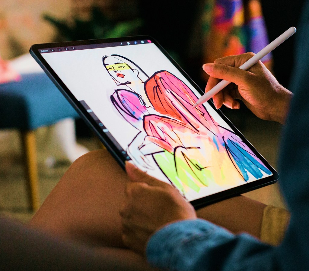
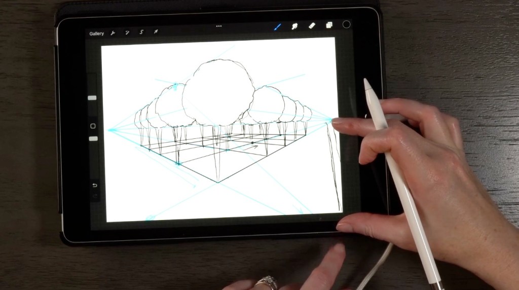
    But with these pieces of kit, I feel as if we as designers sometimes use them too often to hide our mistakes instead of embracing them. We erase or hide errors instead of letting them show us something we hadn’t thought of before—turning off a layer instead of exploring a happy accident. It also stops us from practicing key basic skills for freehand shape drawing and manual shading.
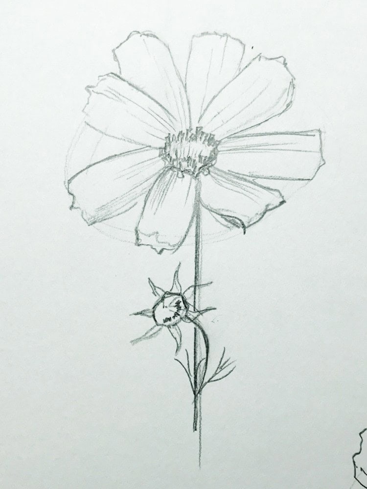
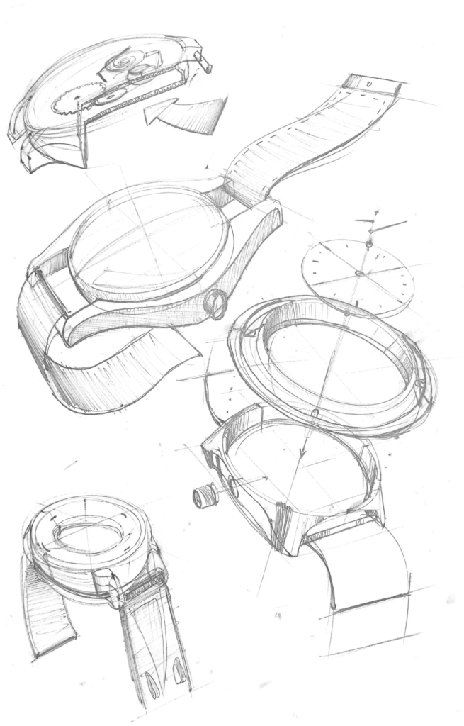
    I think these tools definitely have their place in the design world to help refine how things look and give the best visualization of an idea before prototyping. But I do feel as if we can be too quick to skip straight over grabbing pen and paper, making mistakes, and allowing those mistakes to improve our work.

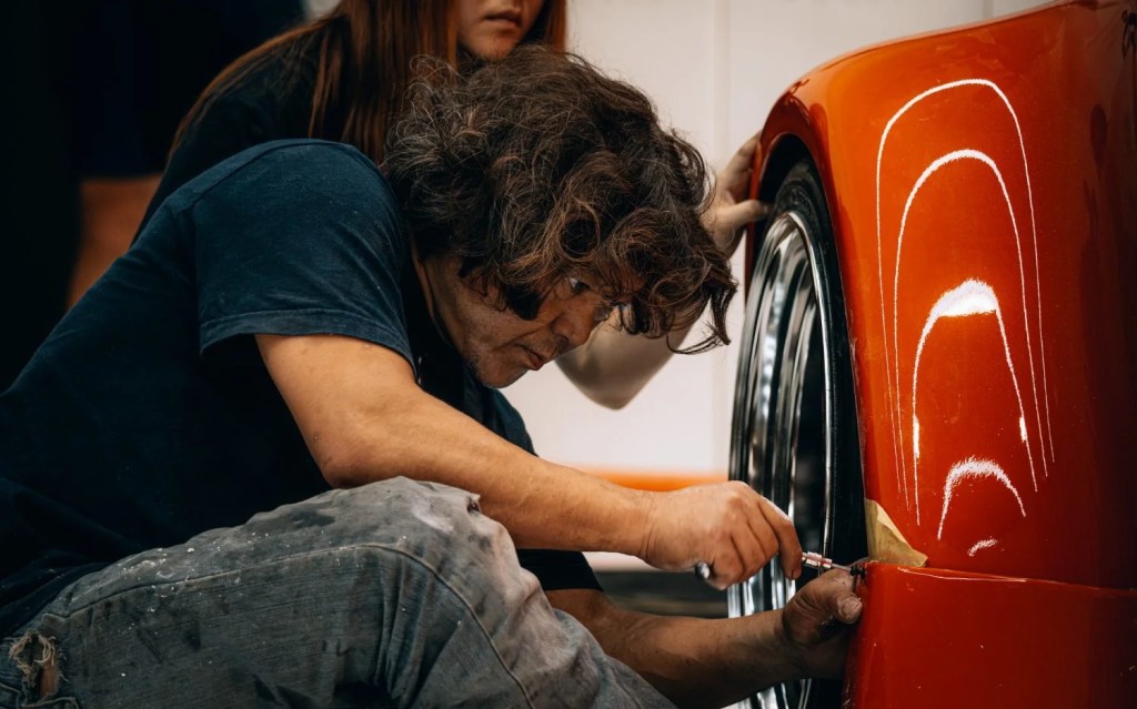
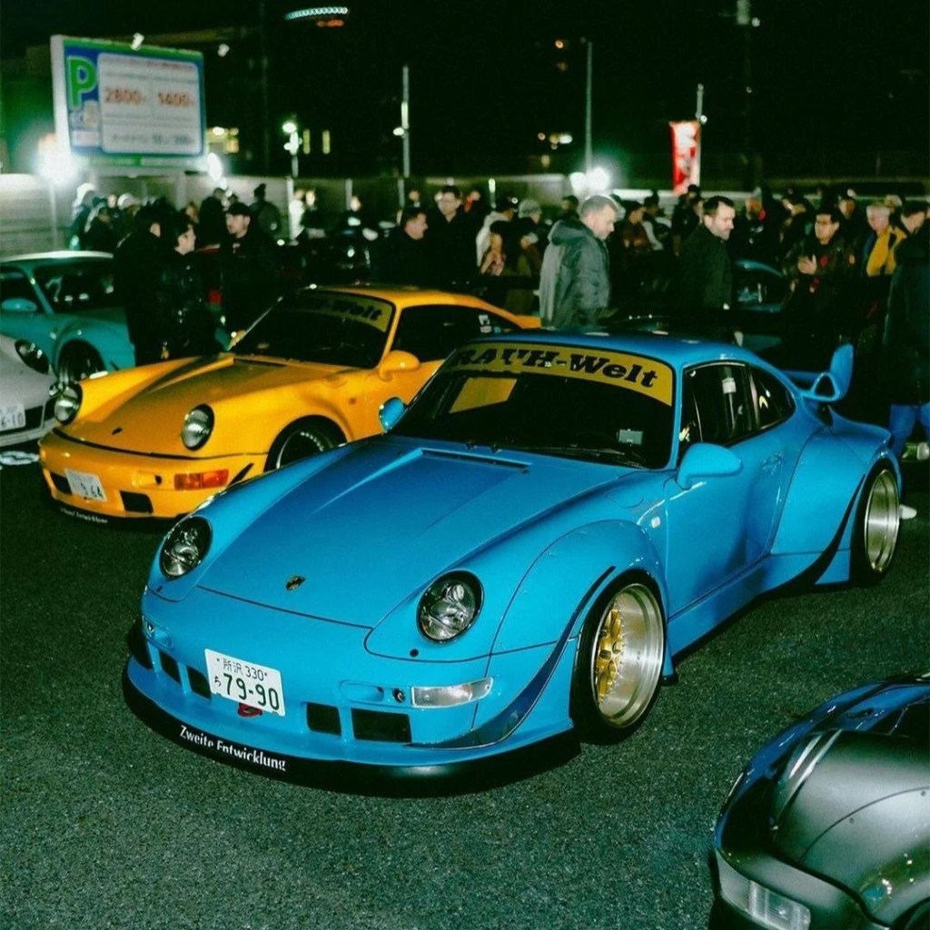
  • The Porsche 911 is a stunning car—a near-perfect combination of elegant design and raw engineering, producing a machine that functions seamlessly as a racer, a cruiser, and a work of art all in one. You’d think it couldn’t get any better, and until a couple of years ago, I would have agreed. Then I discovered Akira Nakai, the Japanese car tuner and founder of Rauh-Welt Begriff (RWB), which translates to “Rough World Concept.”

    Brief History

    Akira Nakai was born on October 15, 1970, in Chiba, Japan. In his early years, he dedicated his time to honing his customization skills, working on suspension, stance, and aerodynamics to build cars that were as functional as they were aggressive—skills that would later lay the foundation for RWB.

    His methods require no measuring tape and no sketches—just a clear vision in his head of the end goal. Watching him work is an art form in its own right. What stands out most is the raw intensity behind his process: there is no gentle touch, just saws, power drills, body filler, and a whole lot of tape. Yet, despite the heavy tools, his entire workflow is astonishingly calm. There is no rushing or stress—just quiet focus

    As designers, we should try to embody Akira Nakai’s philosophy more often: worry less about rigid measurements, stop obsessing over exact perfection, and embrace the raw, hands-on process. Have a bold idea in your head, trust your instincts, and see where it takes you.

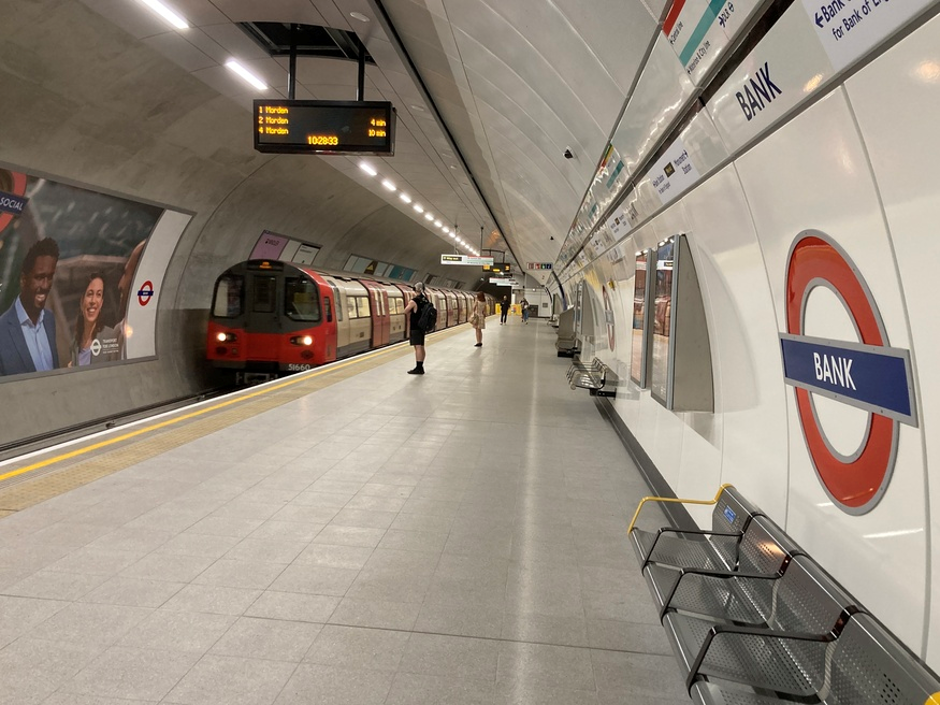
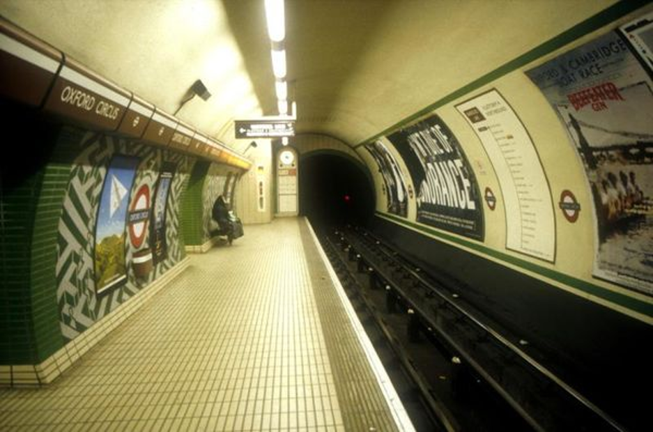
  • Before Week 1 the MENG students, and some BENG students took a trip down to the London design festival. It was a really cool experience, (particularly as I had never been to London before) looking into what current designers are up to currently. As the festival was so spread out we found ourselves travelling on the underground for quite some time. One thing that I noticed about this was the use of colour. At the top of most stations there was a lack of colour, design, and overall fun about the place. Where as when you went deeper down onto the platforms there was an abundance of colour in the tiles, with cool shapes and designs.

    Modern image of London underground, large use of white and grey, lck of colour and shapes
    Image of the London underground, can see the use of green and white to create cool patterns

    I feel this contrast shows a issue with modern design versus older design, the new things lack colour, fun, imagination, it feels very grey and black, which isn’t a bad thing as such as it gives somethings a very sleek finish. Whereas when you look back intime, i.e. the platforms, they used a lot of colour and shape to give an overall fun vibe things. Personally I feel this comes from the demand to make things as efficiently as possible, to reduce cost, time, and  complexity. I feel we are in world driven by those three things that we as designers will do anything to cut corners, which isn’t necessarily a bad thing, and the expense of truly creating something beautiful, or with character.

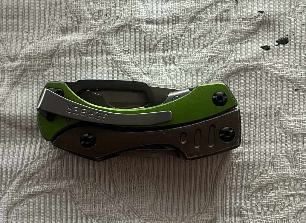
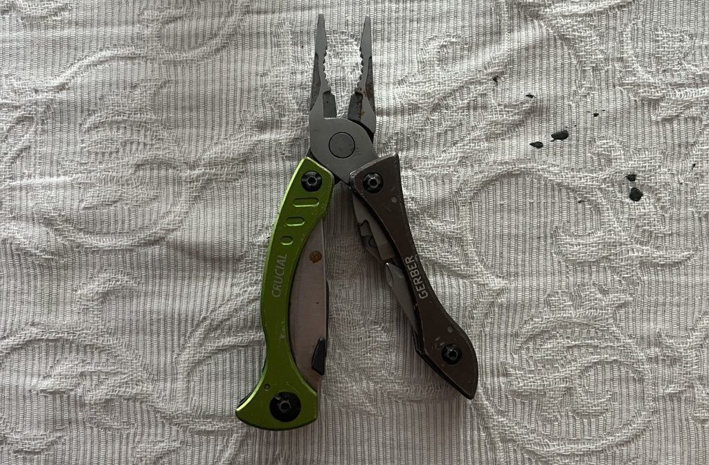
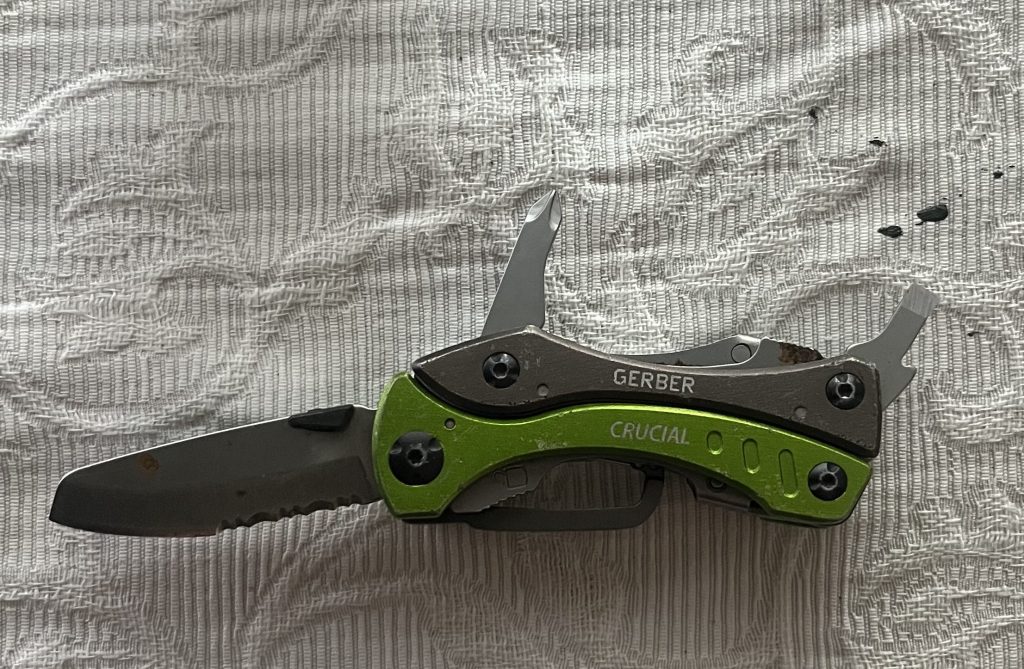
  • As part of Week 1 of the MENG course, we were tasked to bring in an object that we thought was an example of great design. It could be anything that we thought of, from the simplicity of a pencil sharpener, to the complexity of the Empire State Building. After much thought and walking around my flat looking for things that really spoke to me I eventually landed on my multitool: The Gerber Crucial Multi-tool.

    Working in a boatyard during the summer, having a multi-tool on hand is invaluable. Being able to use pliers, a knife, and screwdrivers at a moment’s notice—without carrying a heavy bag of tools—makes a massive difference. Its compact design allows it to fit easily into my pocket, and its minimalist exterior gives it a rugged look where scrapes, chips, and dents only add to its appearance.

    Small compact design
    Pliers easily accessible
    Strictly the essential tools

    I use my multi-tool daily at work and keep it on my person at all times; in a way, it has become as essential as wearing clothes. The weight of it feels comfortable in my pocket, yet I immediately notice when it’s missing. Having it with me provides a real sense of utility and comfort.

    So why did I choose this multi-tool as my object? You might assume I brought it in for a wide, diverse range of functions, but it’s actually the opposite. What I appreciate most about this tool is right in the name: Crucial. It only has what I actually need—no unnecessary gadgets, redundant features, or extra stuff. It feels as though the designers have simply taken something that has the ability to have so many things and deliberately said ‘no, lets keep it crucial’.

    I feel this is a good object to have in my mind when I am designing in the future, instead of adding to a design, look at what I can remove to simplify my design.

  • My website set up for me to share what I am up to in the world of design, take a scroll, page will get up updated weekly!!!